
I’ve been wanting to use this certain piece of Sassafras paper as a background, for ages now, and when I made a new profile pic for my Facebook, I knew it was the perfect picture for the layout I had in mind. I also noticed the sketch over at Sketchy Thursdays would be perfect and make for a clean and simple layout to help the background paper really shine.
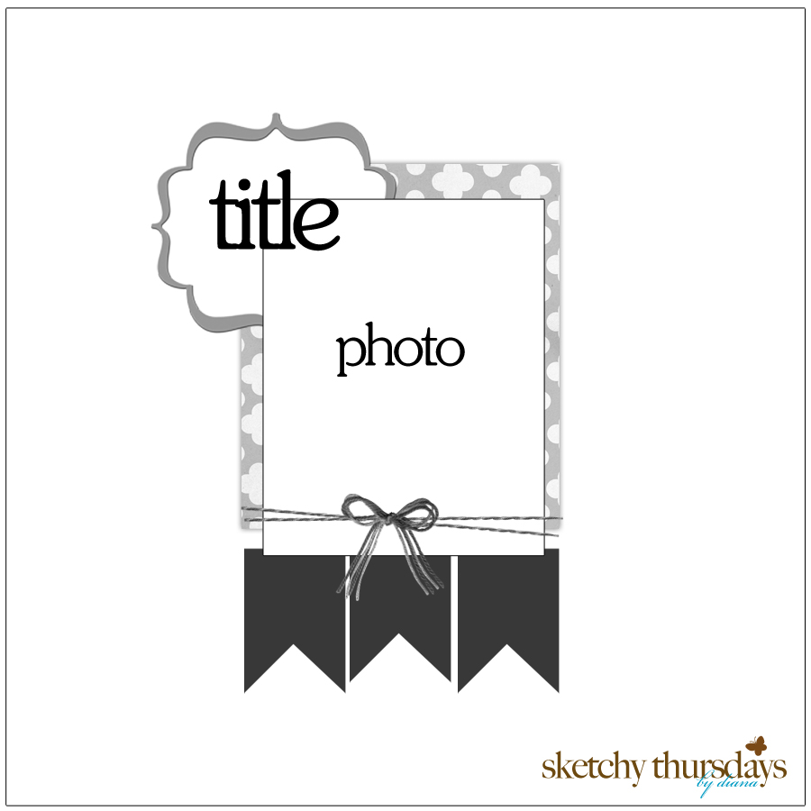 |
| Sketchy Thursdays 10.27 Challenge |
I stayed pretty close to the sketch, and the paper already had cool distressing on it, so I just added the photo, a few details, and the title. Easy peasy! The accent paper is Lilliebee Design, and I made flags from 4 different pieces from the Fly a Kite pad by October Afternoon, and sewed them onto the paper with my half-sized sewing machine (by Kenmore).

Title letters are Blue chipboard Thickers (which I doodled), Sassafrass glitter alpha stickers (which I outlined), and White chipboard Thickers (which I inked). I made an accent piece using another piece of the Fly a Kite paper (blue text paper) and used my Nestabilities 4 set and the reverse stencil technique to put a brown inked border on it. Then I layered and doodled a couple of Sassafrass stickers and a punched heart. I added my journalling at the bottom right, and spaced it so I ran out of space so it seems like it was a piece of a bigger piece of journalling.

Here is the process vid:
Last week I made this layout about my Dad, who had been on my mind the past few weeks (he died 6 years ago of cancer related to asbestos exposure):
 |
| Ships Start Here layout |
I was originally going to do an art journal page about this, but then decided to make it 12 X12 instead. I made the background paper using vintage book pages and Claudine Helmuth Multi- Medium. Then I went over it with a thin layer of white paint dauber. I used a few different black and grey mists and some Tim Holtz gears, and some real nuts and screws to make the masked part.
 |
| Left cluster |
The left cluster includes a part from a BC comic (inked with Broken China distress ink) a printed copt of the Ships Start Here logo, which was the inspiration for the layout, some doodling, bits, and a journalling spot that has one of my recent Facebook statuses.
 |
| Main cluster |
The main cluster has 3 photos of my dad, wooden brads (he was a woodworker), duct tape (his favourite multi-purpose fix-it tool), film strip ribbon (he loved slides and photos), Tim Hortons, Lee Valley, and Vitamix logos (he loved all those), his United Brotherhood of Carpenters and Joiners sticker, captions typed with the typewriter he gave my mom (layered over my cool new CM border punch), and some gears and a nut.
 |
| Top cluster |
The top cluster is mostly journalling pieces layered with some gears and doodling. Journalling was also typed with his typewriter (the one he bought my mom, but he used it a lot too). I could’t decide if it was done or not… it’s not very “pretty”, or colourful. I had actually planned to stain the background paper with a subtle colour, but forgot until the layout was half-finished so it was too late. I’m not sure f I like it, but I guess it’s hard to do a tribute layout and feel like you’ve done it justice. Anyhow, I thought I’d share it.


